
The purpose of this study was to create branding for a high-end restaurant along with a print menu, drink menu insert, and a tablet version for the servers. I used a slightly off-white and black for the brand colours to give a luxurious, bold look and tie into the nightlife aspect. The 'PRIME' word-mark was made by modifying the font Goldman Regular. The subheading is Montserrat Black, which allows the focus to be on the word Prime. I created a minimalist steak knife icon on either side to tie in the modern, luxury feel and symbolize strength. The logo can be shown in embossed gold where possible, such as the outside of the menus.
Menu
For the menu design, I used Montserrat Black for the headings, and Source Sans Pro for the subheadings and body. The clean, modern san serifs reflect the restaurant overall. I wanted the designs to feel high-end and luxurious, while also modern and minimal. I consistently used the knife design throughout to tie the designs together. The print menus were given high contrast with a light background to be easily visible in the dimly lit restaurant.
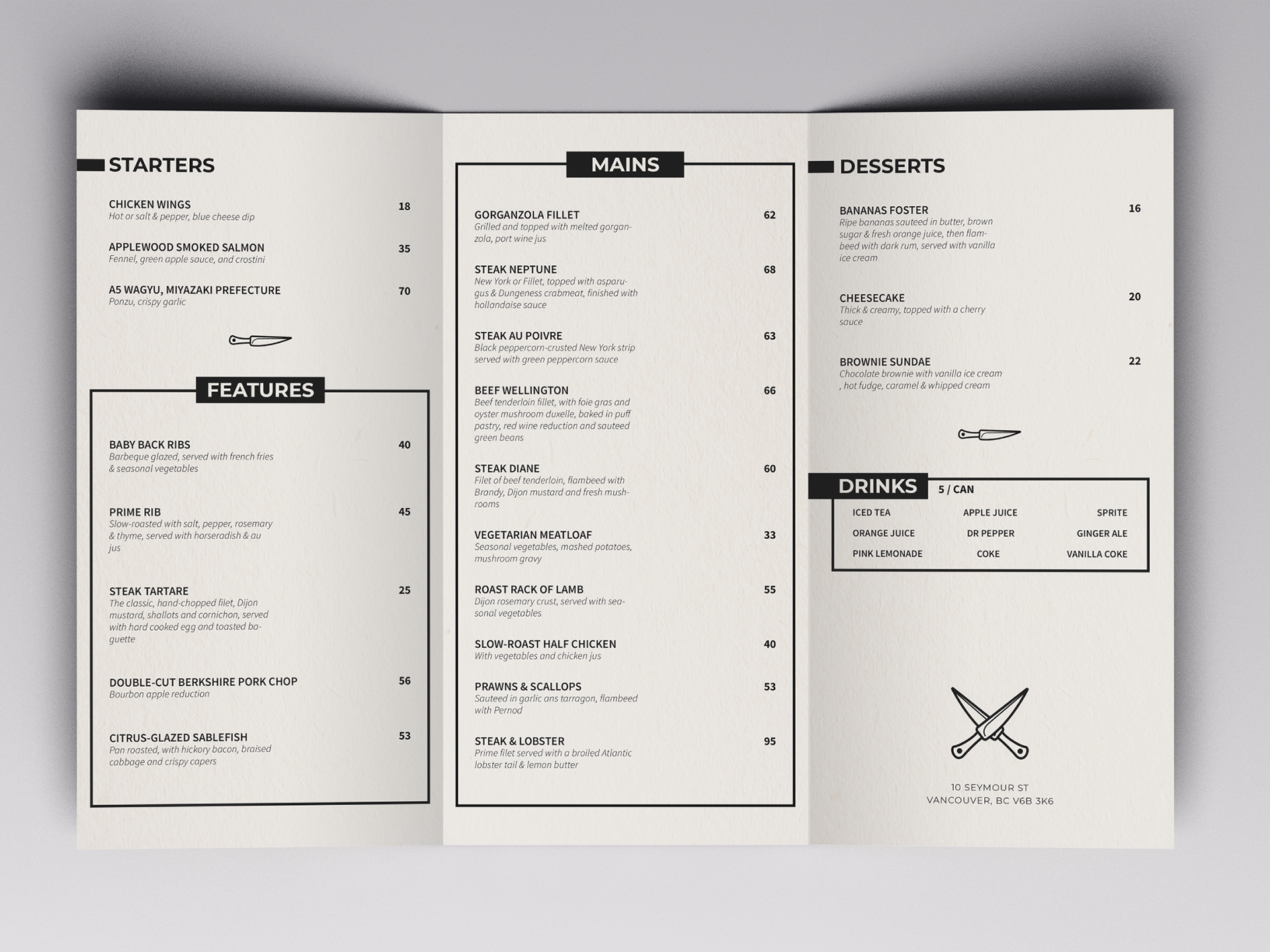
DRINK MENU

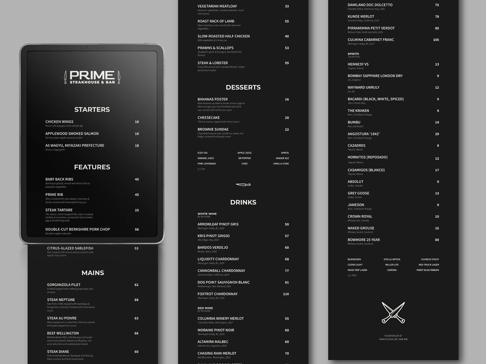
Tablet
For the tablet design, it needed to be dark to not cause a bright glare on the workers faces in the dim restaurant. I went with a dark grey background. This is to ease the eyes, as a black and white contrast can cause eye strain on screens. Again, I used a clean, minimal, modern design that stays fully consistent with the print menus.

Programs used: Illustrator, Indesign, Photoshop